Writing for the Web

The Web is different

man using binoculars

  • Reading a Web site as like looking at a billboard through binoculars.
  • You can’t see it all at once, and you have to concentrate.
  • The resolution is much lower than in print, and you can’t easily tilt the screen or adjust your distance.
  • Light is projected into your eye rather than being a diffused reflection.
  • There is rarely a single linear path through a Web site.

Understand the push-pull models

cat We’re used to pushing information at our audiences. It’s the “spray and pray” approach.

Now they’re pulling information from our Web sites – getting what they want when they want it.

Like cats, our visitors go where they want when they want.

Understand what makes a Web site work

Puzzle pieces
All five components shown at right are important.

  • Disorganized information on an unreadable page won’t be effective.
  • Stale, outdated ideas won’t work.
  • Interactivity isn’t essential, but it certainly improves the visitor’s experience if it’s done well.

Analyze the audiences

  • examine shared contexts – are you assuming too much understanding?
  • what are they seeking when they visit you? have you designed the site around that?
  • what do they already know or think about your product and your organization?

Clarity – getting through

  • Web users have the attention span of a five-year-old; if they get confused they will leave
  • knowledge isn’t power – structured access to knowledge is
  • your job is to report, interpret, annotate, and link; hypertext is a powerful tool for doing that well

Build in quality

  • updates, additions, maintenance are critical
  • don’t use other people’s writing as-is unless it fits
  • test thoroughly

Build in interactivity

  • it keeps the reader engaged
  • but only if you design a dialogue, not a monologue
  • reward each action with new, relevant information
  • test how it works

Organize it as you write it

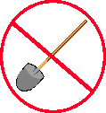
  • design it for online – you can’t just shovel it over from print
  • watch the length — it has to be about 50% shorter online unless it’s a “destination page”
  • use PLAIN language — because it works better online
  • chunk it, design it as hypertext
  • learn how to write link text that doesn’t break the flow
  • give up control to the viewer
  • understand that nearly everyone scans instead of reading
  • structure for multiple audience(s) – hypertext helps you do
    that
  • write with a human touch — the impersonal Web needs that
  • design in measurement and feedback

Present it

  • the writer can’t stay aloof from the details of presentation
  • don’t be bullied by management or designers or techies
  • use graphics wisely and not too much
  • remember you don’t have much font control
  • use titles, headings and white space to improve readability
  • think hard about how to let visitors print the page if they want to
  • use links wisely — to add value to your site, not to send visitors away.

Provide navigational aids

  • provide a brief introduction and orientation on each page so
    any page can stand alone
  • check all the links, ideally with a link-checker tool
  • indicate information status when necessary (new, not new but
    recently reviewed and confirmed, etc.)
  • write links so viewer can tell where they lead
  • provide meaningful titles

Last Reviewed: 13 years